Not sure if this would be more appropriate in the dev section. Anyway:
For quite a long time UIs have not been making any sense to me. It started with Windows 8, then forums, websites, Gnome, Unity, Androids material design and, last but not least, ownCloud (it started with ownCloud and nothing has changed with Nextcloud until now). They all waste a ginormous amount of space on all kinds of screens and increase the amount of clicks to achieve any goal.
In ownCloud/Nextcloud UI-wise the change that sucked the most was the menu. That was before I got to know ownCloud though:

The menu is on the left and takes way too much space of your screen, due to the icons which are way too big. Now, instead of making the icons smaller, making the ownCloud logo smaller and putting the icons into the blue area on the top, where there is more than enough space, ownCloud decided to move all these icons away, behind a menu button, requiring the user to do two clicks, instead of one. Two clicks instead of one is not a matter of taste. It is actually twice as many clicks. Although it could be solved differently. This was a bad solution which was made even worse.
I know, you are screaming right now that there is an app for that. Sure. The question is why that app even exists. I think it shouldn’t. Direct Menu is the third highest rated app in the store. I’m sure this is not only because it is well coded but because that hidden menu actually sucks.
Just look how many icons you could fit in that black bar: one click less. Same goes for the menu on the right. It could also fit into that black bar. The Icons for users, admins etc. are distinctive enough to leave out the describing text. Even if not, I think it would be enough space for icons and text. Why wouldn’t you want a logout button in the top right corner? That’s intuitive. That’s how your banks UI looks like. That’s how your mail interface looks like. Thats how almost any account you log in to looks like. That’s not how the Amazon UI looks like. And that drives me crazy too 
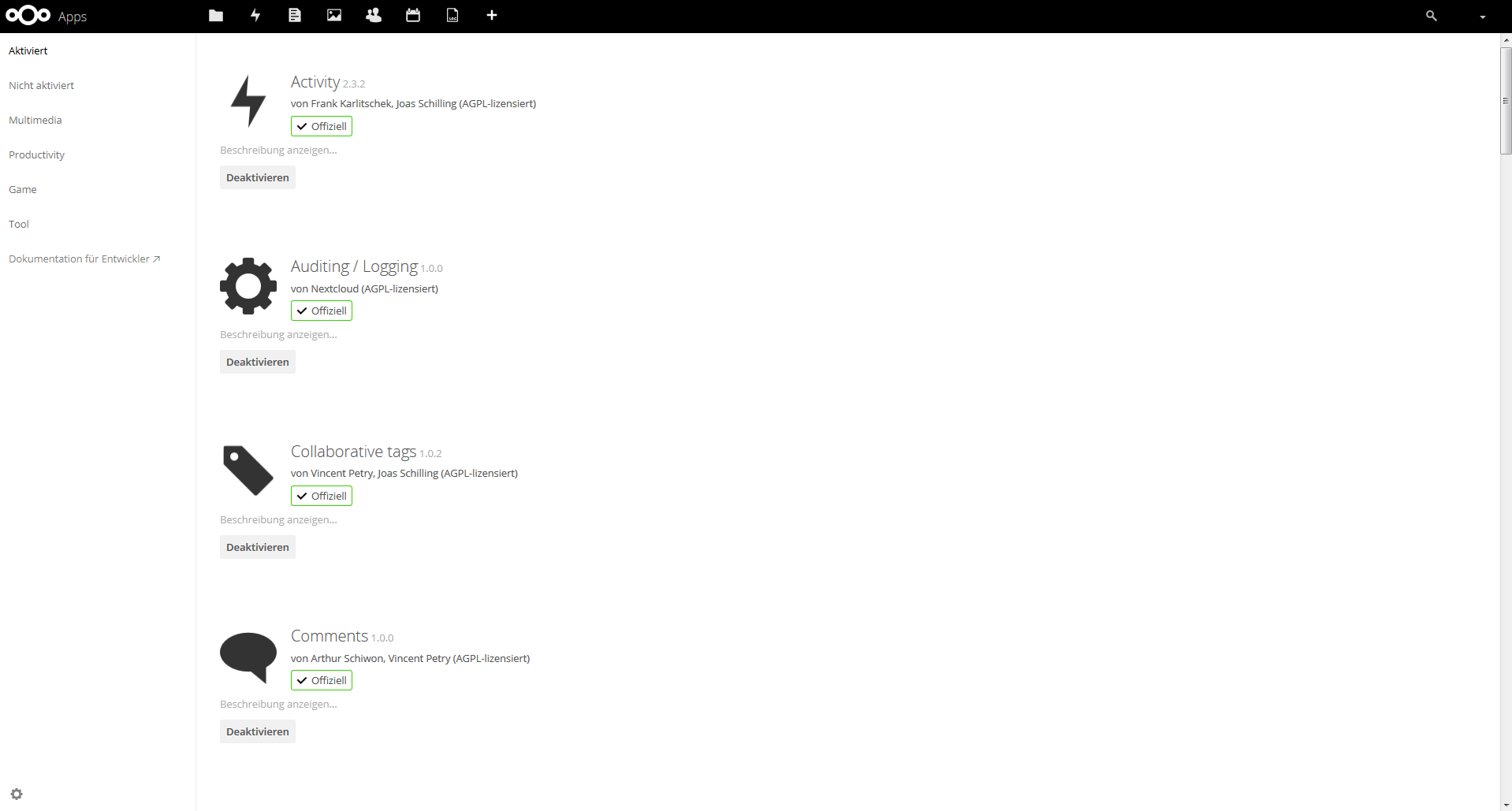
This is probably the best example for wasting space on screens:
It fits 4(!) apps on one screen, leaving more than 2/3 of the screen white, without offering really much of information.
More on white space? Sure:
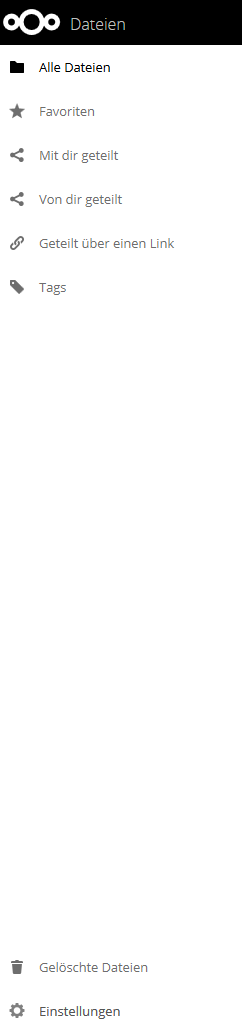
The navigation bar on the left side is never full. Most of the time more than half of it is unused. And yet someone thought, it was a good idea to hide further settings behind a wheel which I often don’t even notice. Why not just show what is in there? And why is there a trash bin next to the settings? I think trash bin should be an app.
Let’s stay with the side bar. The buttons are pretty big. I still miss them too often. I am pretty sure this is because they are not separated from each other by lines, like for example the files in the files app.
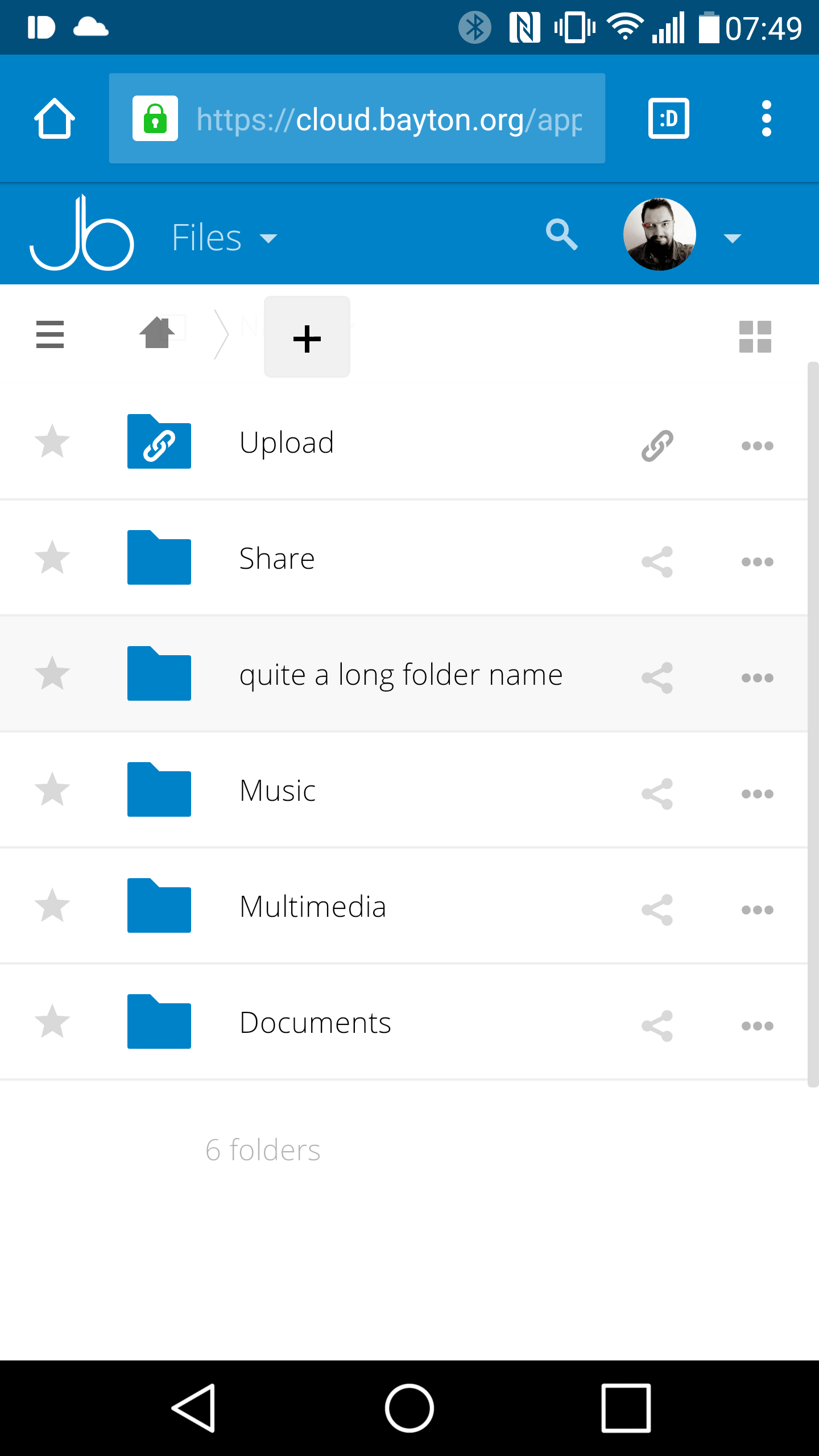
Oh, the files app… let’s rant about that one for a bit:
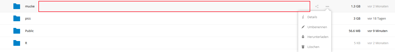
Yep, definitely not enough space for 4 icons. Better do two clicks instead of one. That not only makes it a little tedious when you work a lot with Nextcloud but it also makes it harder to understand for some people. I don’t want to explain to my mom again and again that she has to click the three dots and then download…
Let me finish off by saying that Nextcloud is awesome. I’d be interested in arguments for and against what I said above and whether anyone feels the same way about the UI. I am aware that some of the things I criticized are made in order to be usable with other devices besides desktops. And I am aware that there will be a new store soon for Nextcloud. I just hope that this will be better in the regards I mentioned.