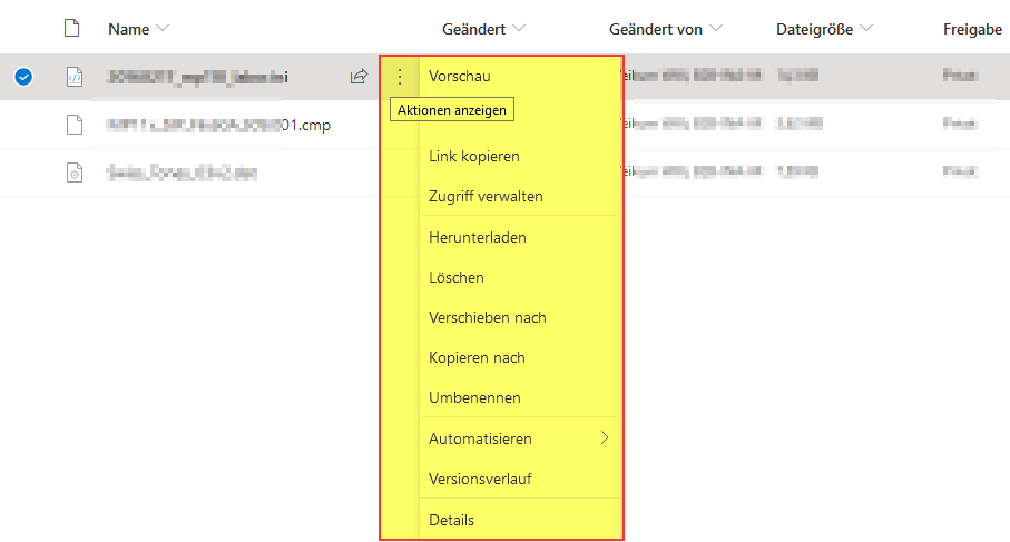
I’m unhappy with the Nextcloud actions menu. Every action is hidden behind the three dots menu. From my point of view common actions of every app (files: delete, rename, copy,move, paste; image viewer: delete, rename, resize) should be accessible by dedicated buttons. I don’t find any good reason to do it this way. If there is any discussion or design document about this could you please link me there? I only find one discussion from 2016 May be there is a reason to do it this way, I’m willing to learn about this decision.
please enlighten me with you thoughts.
do you like the current design?
is there any extension or CSS hack which provides the “more direct” menu style?
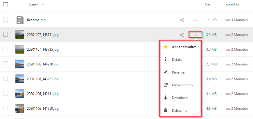
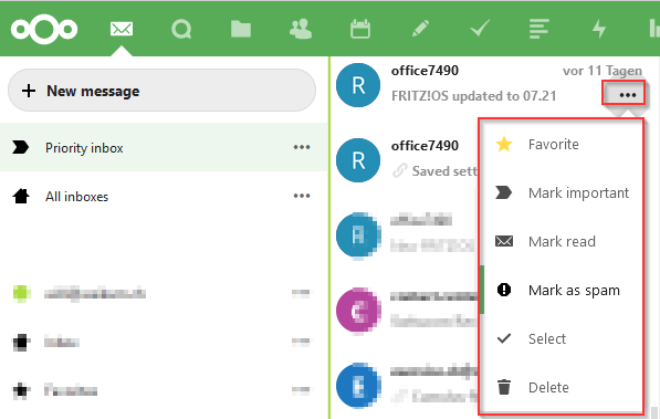
In Files app, I would expect at least delete, copy, move, rename to be directly accessible (at least after the file has been selected). but it seems to be some general design pattern, maybe guideline as all application follow this method like Mail:
where Delete, Mark Read/Unread in my eyes are important enough have direct access. The same applies to other apps as well, in Talk I would like to have "Copy link, Start Call directly accessible in Notes, Contacts, Image Viewer delete, edit are good candidates.
In other words if you use Nextcloud Web UI almost every action in any apps needs an additional click on “three dots menu”, which I feel bad usability. For sure there are technical and aesthetic reasons to do it this way - less buttons make the UI look cleaner, nicer, maybe it’s easier to add actions to the menu rather to the main page.
My preference is “design follows function” - at least important functions are immediately visible and the user can perform them without going through additional menus. I want to ask how others think about this - is it just my personal preference or would the community appreciate to change it somehow? If yes what do you like? Maybe there is already a way I’m not aware of?
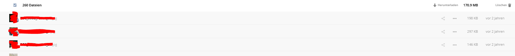
Off-topic @rakekniven: you are an active translator, did you hit the issue already I see now in my instance: I selected language “English US” with Locale “German” settings - and now the UI is English but “modified” column shows German strings “vor 11 Tagen”, “vor 2 Monaten”?
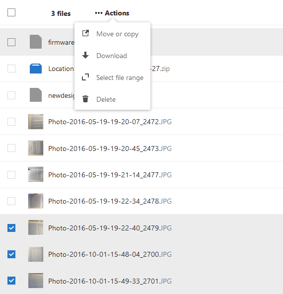
Yes, I have noticed the same thing. When I select several files and I want to do something with them, I have to go through this 3 dots menu, normally you want to copy or move and look for an icon or text and it needs some time and it’s not very user friendly through this menu:
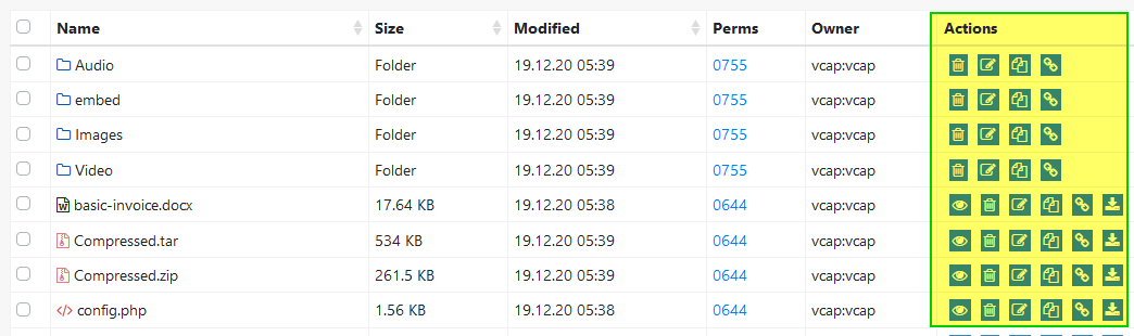
@wwe from the example of Google Drive in the actions on top, and especially in the example of Tiny File Manager a big problem is immediately apparent: One can only guess what each of the actions mean, since they are not labeled.
This is a huge usability and accessibility issue, and they would have to be hovered/focused every time one uses the app. (Yes, some people assume icons only look nice and such, but they are horrible for people who do not use an app every day. Google Drive has the additional issue that the actions are separate from the file, which is very odd.)
Hence we only show the absolutely most relevant things right away:
Opening a file: Simple, you just click on it
Sharing it: Share action is shown outside of the menu
Renaming, moving, copying, etc: Not so common, so it’s in the menu
Delete: Destructive, so it’s in the menu
The general issue also is: “If everything is important, nothing is.” Meaning if we show every action right there, people won’t easily find the most commonly used ones.
Hope that clears it up?
I do agree with @tflidd’s observation however that the multiselect actions could at least have 1 action be outside of the menu (icon + text inside a button of course) or even all 4 of them. Then on mobile we of course still need to collapse the actions into a menu.
Mind opening an issue for that? Thanks
@jan I understand your logic, your observations are not completely true in my case.
(for me) sharing is least used function, this could go to a menu
delete/rename/move/copy files are most common functions
delete doesn’t become less destructive if you hide it behind a menu
especially in the image viewer I really wonder the only available action is play (start slideshow)
In fact Google’s way is less intuitive if you work with one item. If you select multiple items this becomes the better way to start action (it makes more clear the action applies to multiple items and not only one).
Don’t get me wrong, maybe I’m using the system in a way it’s not designed, maybe other users a totally happy with the UI as it is. This is the reason for me to start a discussion where devs and users can describe their expectations and maybe other users share a hint to overcome the limitations.
I see the fact that items within menu are better recognizable - at the price of additional mouse click for every action. At the moment it makes me sad every time I access my Nextcloud through browser, so I tend to use my local PC applications to manage files and images. If this is the idea and Web UI is only intended to be sort of fallback for local operations, I agree this good enough. If the idea is to make Web UI the primary way to interact with Nextcloud then I think every additional click is worth talking about it.
@FadeFx thank you for this hint. I have the app installed already. In Files app it seems to duplicate the three dots menu (still a mouse click, little move convinient) and in other applications it is not present… Do I miss something? is there a way to configure it? I don’t see any user docs…
@FadeFx@wwe the right-click menu was actually integrated in the core of Nextcloud already with Nextcloud 18 (if I remember correctly). So this is a good shortcut, and it’s in by default. And yes, at the moment it is only in Files though.
especially in the image viewer I really wonder the only available action is play (start slideshow)
so I tend to use my local PC applications to manage files and images
Desktop file managers also have these actions in a menu, which is the aforementioned right-click menu we also support.
That said, it’s of course not set in stone. However, we will likely not make any changes in that area before we move the Files app to Vue as well since there would be too much potential for breakage.
I don’t agree: in the past even Windows Explorer - the worse file manager on earth - had detached “Google style” buttons for some operation copy&paste and delete file (unfortunately it’s not the case anymore). But most of other file managers provide buttons and keyboard shortcuts for common actions, so some webapps like Outlook Web App and Gmail do. Definitely there are different favorits - some people prefer menu attached to the file, others prefer dedicated buttons but there should be some direct way to access common options (preferrable 1-click or one key-press). Again there is no one fits all solution - most likely the user has different intention when she acts on a single file from the viewer in opposite to multiple files from the list.
But the file manager discussion is heading away from my initial intention: every app is affected - most apps like Viewer, Mail, Notes don’t provide easy way to perform common operations in context of current item or collection of items.
I’m happy with the fact an important member of the dev team recognized the issue. I absolutely agree this is nothing one can change immediately. Such a change affects every user of the software - you can’t try&error - the solution must be at least as good as existing one, but I would really appreciate you discuss the topic in general with other devs - maybe you can integrate some improvements while you move towards Vue - it’s always easier to build something from scratch rather change it later… Eventually you can define some guideline how good UI should be in this terms…
The three dot menu for single files is no problem in my opinion, although deleting sharing and downloading are so common icons that would never be misinterpreted as @jan pointed out as a possibility. And the sharing icon is a thing already, so why not?
If deleting via a single button click is to easy make a small context menu or make it a double click like the feature when trying to delete a calendar (just without the 5 secound countdown^^).
Maybe there would be an option to make a plugin like AppOrder which is quite perfect with its admin settings giving much freedom to optimize nc to the needs of the own users (which differs quite a lot between usecases I assume).


 Thanks