Issues in Nextcloud UI development

A disclaimer to avoid misunderstandings: I use and maintain a number of Nextcloud instances and support about 80 users. I always recommend Nextcloud as an open source alternative to commercial services. When I write about issues here it is intended as feedback for possible future improvements. On the other hand I already maintain a number of other projects and have a full time job as team lead, therefore my time to contribute code to Nextcloud as well is quite limited - eventhough I did this in the past as well.

I recently updated Nextcloud to version 32 on my test system (which I always to with major updates before migrating my production systems).

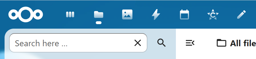
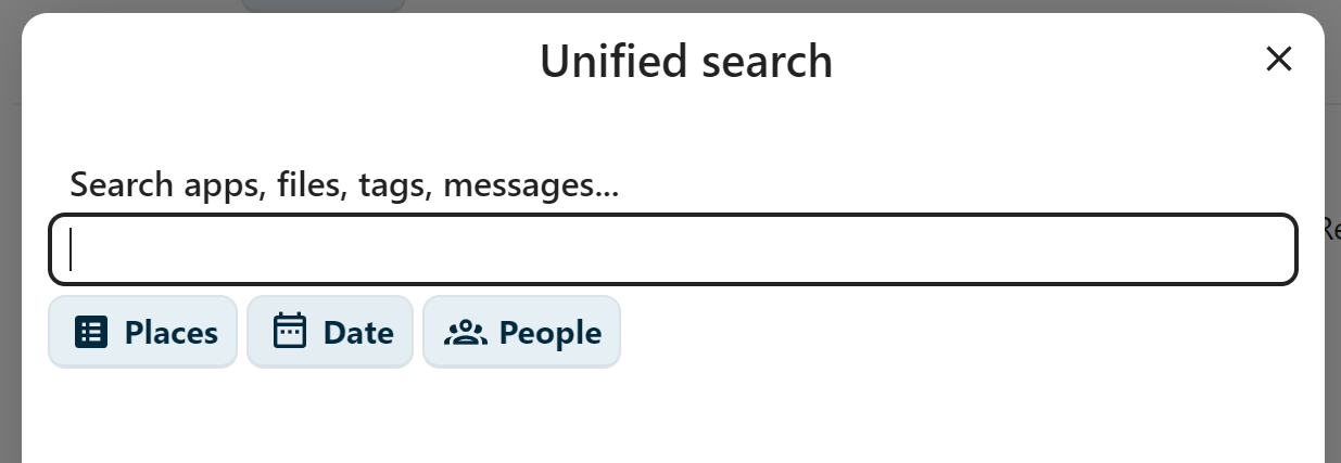
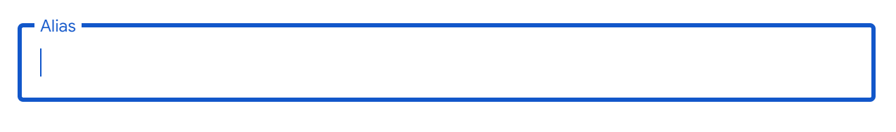
The login from still does not use regular labels but smaller sized labels which are positioned on the border of the input fields which looks like this is an error and not intentional:

Why not labels with regular text size to on the left or above the input fields? That would be much easier to read. What is the rationale behind this layout? And why are the label elements placed after the input elements in the code? The other way - first label, then element - would make things much easier. At least one could use custom CSS to change the layout to make it a bit easier to read.

I also noticed that the new toolbar icons are now using a fading effect to make them look “3D” by applying a linear-gradient mask to it:

There are good reasons why monochrome icons should not using a gradient: not every display shows the gradient in the same way and shapes can be harder to recognize. Design should always keep usability in mind. I did not find any option to disable this - but using CustomCSS this can be changed, so this is not a big deal.

On the other hand, the scroll bar of apps with scrollable content (Files, Collectives pages, App list etc.) is still cut of by the rounded corners (I think this issue exists since the rounded corners inside the square viewport got invented). At least it does not look correct and the scroll bar should end a bit higher:

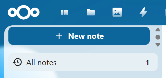
The “notes” app has also still scroll bar where there should not be one (I reported this bug nearly a year ago - also see https://github.com/nextcloud/notes/issues/1395 ):

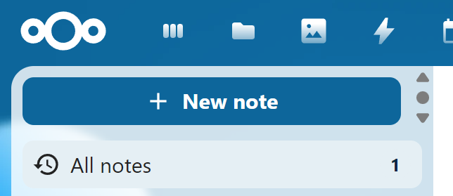
And yes - you can even scroll the “New note” button up:

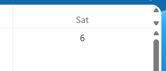
And another bug is also still there - unneccessary scroll bar in the calender view:

And this is also still an issue - when the context menu in the files app needs to be positioned above the file, it will not be at the file itself, but at least two lines higher than the file:

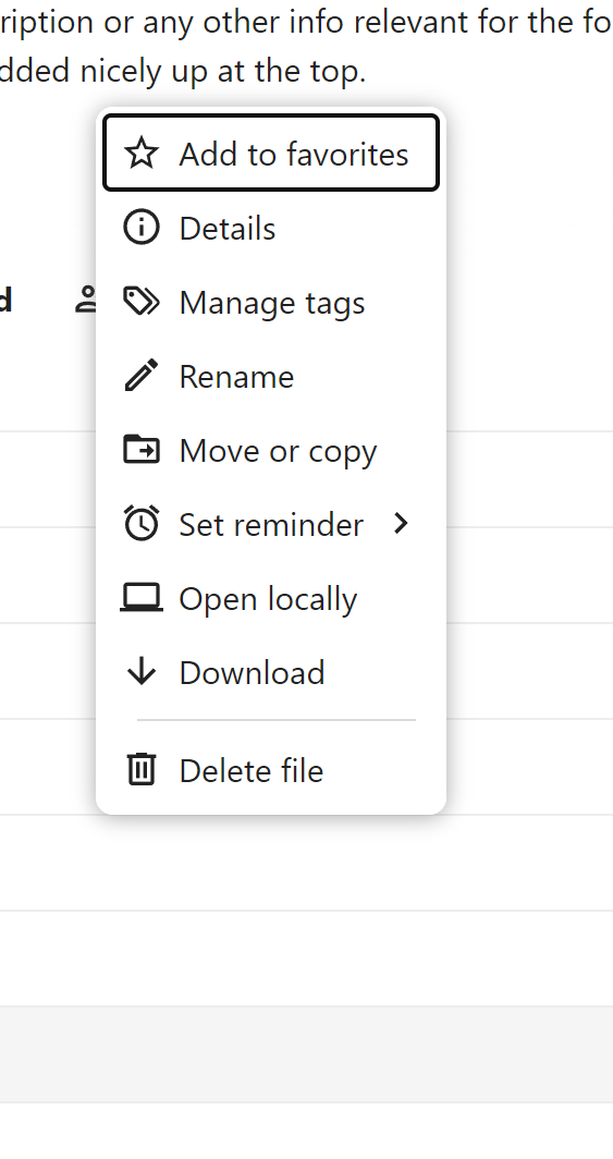
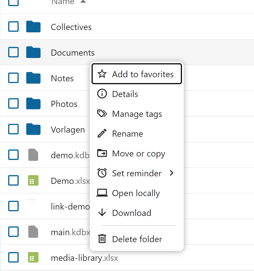
The correct placement would be just at the file itself, like it is, when the menu opens downwards:

And this is all a standard vanilla Nextcloud setup with no customization at all and tested using current versions of Chrome, Vivaldi, Edge and Firefox - all browsers show the same issues.

When the context menu was still a separate app for the “old” UI of Nextcloud it worked much better. So I wonder how this happens. Yes, I am aware, that “Notes” is not maintained by the same people who maintain the core Nextcloud UI. But at least in the core applications like Files or Calendar these little “glitches” leave the impression, that the UI seems quite hard to maintain.

Is there some design review process to make sure, the UI is consistent also along different applications? Are there any guidelines or code examples how to build the UI of apps to make sure, the UI is done as intended?

2 Likes

Example for a little change which can make the look much cleaner - apply a right and bottom padding of 4px to the .page-container class - and then the scroll bar does not look “cut off” at the bottom:

However this also means even less usable viewport space. Especially for smaller viewports it might be helpful to have at least the option to turn off the rounded corner design.

@nimishavijay I think the design decisions were made in accordance with the design group. This might be some feedback for you.

Related to the scroll bars for buttons: This is a UI bug. Could you open appropriate bug reports on github and post the links here for reference?

There is a process in place but this is not mandatory for community apps (Notes is no community app AFAIK). There are certain best practices but this sounds more like unintended bugs than dedicated bad behavior. More consistency is hard to achieve as the apps’ scopes are so broad.

Chris

Just a small add:
The login seems more like your browser doing weird things, for me those only “lift up” when the text box is selected which to me looks good and is the intended behaviour.

For me it looks like this when no textbox is selected:

Then selecting respective textbox outlines the it and lifts the “username ..” or “password” texts

The scrollbars I don’t think have any elegant way of being fixed without compromising real-estate, which is not worth. I hadn’t noticed that clipping since my scrollbar does not show the ends, only the “bar itself” and also hides itself quickly after being stationary - so for me I prefer the rounded corners over perfect scrollbars..

The extra scrollbars and right-click menu are definitively bugs though, it should not be like that.

The bug for scrollbars you’ve already linked, for the context menu there is: https://github.com/nextcloud/server/issues/47970

I tested this with many browsers (Firefox, Chrome, Vivaldi, Edge) - none shows the label inside the input fields, always on the border of the field.

But also a label inside the input field is not really useful. A label should always indicate what an element is used for - like this:

Username: […………………..]
Password: […………………..]

Or this for smaller viewports:

Username:
[…………………..]
Password:
[…………………..]

That’s also the reason why the HTML element for this - <label> - places the content outside the element for which the label is intended for by default. Moving the label inside the input field was a bad idea in the first place and moving it outside and using smaller text just in case you focus the input field or enter something is even worse in my opinion. The default behaviour of <label> is fine as it is and in my opinion there is no reason to change this.

In addition one may also add a placholder attribute to explain what content is expected (like “text”, “number”, “amount” or similar). However MDN recommends against using placeholders since this is not accessible (also see <input>: The HTML Input element - HTML | MDN ). A better approach would be to use the appropriate input type if you need date and not text etc..

For example what I talk about see https://codepen.io/awelzel/pen/WbrwwMz

Another example for this layout decision “we don’t want real labels”:

I don’t know what the problem is when the label “Search apps, files, tags, messages…” would be in regular text size and above the input field?

Some people have problems reading small text and it would be really helpful to make sure that no text is smaller then around 14-16px, which is the default size for the text body used by most browsers.

A more accessible layout could be like this - just a quick hack using the developer tools in the browser:

Yes, this looks “old school” and “not modern” etc. - but the point is, that the design should work for everyone, not only for people with good eyesight.

3 Likes

You’re right, I tested nc 31 instead of 32, being always lifted is new behaviour. Not sure if intended but I prefer the previous way, looks better.

Keeping the label inside the field is quite common nowadays, it both looks better and is more compact without sacrificing “glance-ability”. It’s of course a matter of taste but you’ll find many companies with good UX teams has that kind of label, google, Microsoft, apple to name a few..

Indeed its important that the label does not disappear, but it doesn’t here so it passes, no?

However I now saw the login square changes size slightly when going from no field selected to one, I’ll report that as a bug (unless there is one already).

I am not sury, if all big companies really have good UX teams. Windows lacks good usability in many places (like the awful mix of old and new UI, two levels of context menus in the Windows 11 explorer and so on…).

But as an example, how Apple designed their search feature on the website - by default, the label is inside the box in regular text size:

When you click it, it moves up and gets smaller, but it is still inside the element and does not look that strange. Besides that, the remaining UI gets dimmed as soon as the search element is focused:

Google does it similar to Nextcloud up to version 31 - but the design works better, since the surrounding background is not in a different color as the input field - and again, before focusing the element, the text is in regular size and not smaller, so you can read it, even when you have not ideal eyesight:

1 Like

And it continues with other “glitches” in Nextcloud 32:

I totally understand, that web UIs are not that simple to maintain sometimes. But every major update of Nextcloud or any of the featured apps brings new issues and leaves the impression, that the UI is either very hard to maintain or new versions are not tested very throuroughly when it comes to consistent UI and visual problems.

Hello @awelzel,

please do not misunderstand me, I think feedback from the community is valuable. However, I am missing a cleat call-to-action message here.

You reported quite some of these issues on GitHub which is by far the more useful location in contrast to the forum (devs will probably not look here for issues/bug reports, GitHub is for that). General discussion might be valid (like what you wrote about the design suggestions) but need to be brought to the design team first, to be honest.

So, what is the point of this list of issues? What do you expect to happen? Can you please phrase your expectations (on the community)? Thanks
Chris

1 Like

This one was an intentional design decision, and yeah, I’m not the biggest fan of it either. But for me, it’s far from a showstopper: https://github.com/nextcloud/calendar/issues/7384#issuecomment-3322117969

The rest, as far as I can tell, are mostly cosmetic issues, except for the contacts issue on narrow displays, which mainly seems to affect mobile. But on mobile, you’re better off syncing your contacts and just using the app that comes with your phone anyway, imho. :wink:

Don’t get me wrong: aside from the calendar full-screen view, these are still bugs, and they do need to be fixed (and most likely will be).

To avoid running into these kinds of glitches and bugs with new releases, I can only repeat what I’ve been preaching here for years: :wink: wait until at least the first or second point release before upgrading to a new major version.

Oh, and just for completeness: for business-critical instances, waiting is basically a must, and you might even want to wait longer, depending on your use case and the apps you rely on. It’s also a good idea to keep a separate test instance, since point-zero releases can sometimes ship with more serious bugs, meaning certain features you depend on might not work right away, or some apps may not yet be compatible.

1 Like

My expectation is, that future updates consider testing of the UI in more detail and that UI changes consider the existing layout as well.

Example 1: Calendar

The blank page with the main toolbar still visible in the Calendar detail view does not fit any other app in Nextcloud.

Nextcloud Office will show as full modal view without the main toolbar.

Deck will show a modal dialog in front of a dark modal background without the main toolbar visible.

The text editor and the PDF viewer will show a full modal view without the main toolbar visible.

So it seems, when deciding how the new Calendar detail view should look like, nobody ever considered how other existing apps in Nextcloud do this.

Example 2: Collectives

Collectives pages are now taller as they should be, because some change in the text editor component added padding to the left and right (a Github issue for this exists).

The “callout boxes” now use the wrong colors since the color scheme was changed in Nextcloud (a Github issue for this exists).

So it seems, nobody checked in detail, if Collectives still works as exepcted before publishing an update for Nextcloud 32.

If there is any test user group where I can participate before new releases get published - I can help with that as well.

1 Like

In the eight or so years that I’ve been using Nextcloud, they’ve never postponed a release because of issues like this, or even more serious ones, for that matter. I think a point release was withdrawn once, but I don’t remember the reason off the top of my head. But usually they stick to the planned release dates, (almost) no matter what. :wink:

You may or may not like it, but in the end, as a user, you have not much of a choice, but adapt to it. You could just have to think of the RCs as betas and .1 and .2 as RC1 and RC 2 and so on :wink:

Or even better, help testing betas and RCs and report these things before the release.

Either way, here in the forum, we can’t change those things anyway, and bugs and features are best reported/discussed directly on GitHub.

1 Like

Sure - if older versions still get updates. Unfortunately, Nextcloud 31.0.9 does not offer any other update except 32.0.0. I had the same experience with Nextcloud 30 - as soon as the stable channel had version 31 available I could not get any updates for version 30 any longer.

Anything I miss here?

Because 31.0.9 is already the latest patch release for 31, and I’m pretty sure (someone please correct me if I’m wrong) you can just ignore the update offering to 32, and once 31.0.10 will be released the updater will then offer that instead.

See also: Maintenance and Release Schedule · nextcloud/server Wiki · GitHub

Maybe this is just the first one and more will follow. :wink:

Just kidding! As I said, I’m not a big fan of it either. Maybe if enough people complain on GitHub or better just upvote the respective issue, they might change it in the future to make it more aligned with other apps. I doubt they’ll bring the sidebar view back though.

By the way, if I remember correctly, this particular issue (which, again, was an deliberate design decision) was already present in version 31.0.9, as this change was introduced with an upgrade to the Calendar app. Therefore, staying on version 31 wouldn’t have helped. :wink:

Meanwhile I implemented a custom theme for my production instance which contains a number of workarounds:

  • Collectives uses the same width as the normal text editor (as it was before NC 32).
  • Collectives call out boxes use the correct colors
  • Calendar detail view now looks and behaves similar to Deck card details

Usually I do this using the CustomCSS app - however that does not work (yet) properly with my NC 32 instance, so I decided to implement a custom theme instead (located in the themes folder of Nextcloud and activated using the respective setting in config/config.php).

Collectives:

Calendar detail view (will also adjust for smaller viewports):

If anyone is interested, I can publish the theme with instructions how to set this up this on my website.

Good news: the issue with the wrong text width in Collectives is already fixed:

Width of editor too small · Issue #2020 · nextcloud/collectives · GitHub

I asked today on the Design team about the discussion here. I want to share the outcome from the discussion for you, @awelzel.

In fact there were different kinds of issues identified on your concerns risen here. Let’s address them individually.

Issues with clear scope

There were a few comments on concrete problems. An example are the unneeded scrollbars in notes, e.g.:

For these kinds of issues, this is a clear bug and you are best addressing it by opening issues on GitHub. There, the devs of the apps see the issue quickly and discuss the topic.

Please note, that it is best to open one issue on a topic. So, if there are 3 (different) buttons showing this issue, I would advice to open 3 issues (ideally linking them to show similarities). This way, the devs can keep track of fixed issues.

General styling discussions

Another topic are dedicated styling changes. An example you gave would be

Here are different options to address this. If you can track it down to a GitHub repo, an issue there is a good idea. This might not be a development issue in general but instead a design issue. There, you can mention the design team (use @nextcloud/designers) as well.

If the discussion is more involved, you might join (or be invited to) a design call to have more hands-on feedback.

Strange/unexpected behavior of elements

Let’s take the example you put first:

If this is not clear to you if this was intentional or not: Open an issue :wink:. If this is as expected the maintainer will close it and/or you can have a chat on the topic.

If the problem comes from a library, the dev will be much better suited to indicate the problem on the library and where it comes from (at least which repo to address) than you. Again, the designers can be mentioned if in doubt.


I know there are a few issues to be opened and solved by the devs. @jan offered to take a list of issues into the corresponding design rounds to discuss them in bulk. I would therefore kindly ask you to file issues (unless done so already) and then compose a list of issues here.

Thank you for your understanding.

2 Likes