When I deleted, it went into internal server error mode (I cannot run any root commands as on shared hosting). So, I made the file
to make that section blank. Will have to do with every update, I presume. But okay till I do not have to face the stuff.
Thanks for this guide mate. :slight_smile:
Go into your installation directory example here /var/www/nextcloud
cd themes
cp -r example custom_name
echo “#open-reasons-use-nextcloud-pdf { display: none; }” |sudo tee -a custom_name/core/css/server.css
nano custom_name/defaults.php
Name your cloud instance in the last file. defaults.php
Really, this is a total nuissance.
Every update (even minor ones) this "“£$%^£$^%” is back
Granted, it’s doesn’t take a lot to remove it but it is VERY annoying, particularly for a company that claims to respect privacy.
What I am referring to, is this “in your face” advertising.
I have no problem with promoting and advertising nextcloud, but it has to be done in the right manner.
I also find it a pity that whenever it comes to advertising or messages regarding Nextcloud Enterprise, that there are no proper configuration options. I expect better configuration options from an AGPL software. Another very bad example regarding the user experience is this thread. Nextcloud GmbH does not want to change it at all. And it just looks like shit see this example: https://nc.nl.tab.digital (screenshot). No wonder all users find Microsoft 365 more stylish. In Microsoft are no warnings about possible functional limitations at login. Furthermore, Microsoft would not list this kind of warning directly on the application in a visually unappealing way, but perhaps very discreetly at the bottom or in the settings. As an unknowing user i would be afraid to continue using the Nextcloud instance. Using Nextcloud with more than 500 users is perfectly legal. But in any case, as a user or operator, I would get upset about it every time I log in. The design is bad. Where is the design team to change it?
While I wouldn’t have described it quite so harshly, I very much agree with you.
I really like nextcloud, and I use it extensively (I avoid google, MS, and amazone, wherever I can.
One big flaw in nextcloud is:
to much nerd (and management), too little user…
Don’t get me wrong, being a techi, I like nerd and can handle it quite well, but the users struggle with too much nerdy input.
In order to really get some decent usability input, you have to test with users, who have no clue. As well as documenting the responses from those users.
Only then can you get a truly intuitive user interface.
What’s so bad about it? It only shows up on the user settings page. How often are you on that page during daily use? I mean, it’s not like it’s displayed anywhere where you do actual work. Ok, they could move it to a separate “About” tab, but otherwise this is no worse than any other about section, which is usually integrated somewhere in every software product.
That’s a hole other topic, which I won’t discuss today. Only that much, unlike with the actual topic of this thread, which I consider a non-issue, I’m a bit more conflicted with the user limit, and how they implemented it.
You are right, of course. I also just wanted to remind you, because nothing happened.
And that’s exactly why I would be happy if some things were designed a little nicer.
Back to the orginal problem:
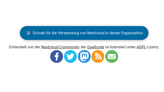
Maybe the blue button with “Gründe für die Verwendung von Nextcloud in deiner Organisation” can better be a small link. It seems a little bit like advertising for Nextcloud. I have no problems with that. But a normal logo or text would probably be more appropriate. it has already been asked several times whether this cannot be changed. Maybe here can be the link to Nextcloud Fair Use Policy and NGO program. Who clicks on the current link, probably learns nothing new. https://cloud.server.tld/settings/download/reasons
