When you look at NextCloud, there are so many excesses that make working with NextCloud difficult. Why is that?
Here some examples.
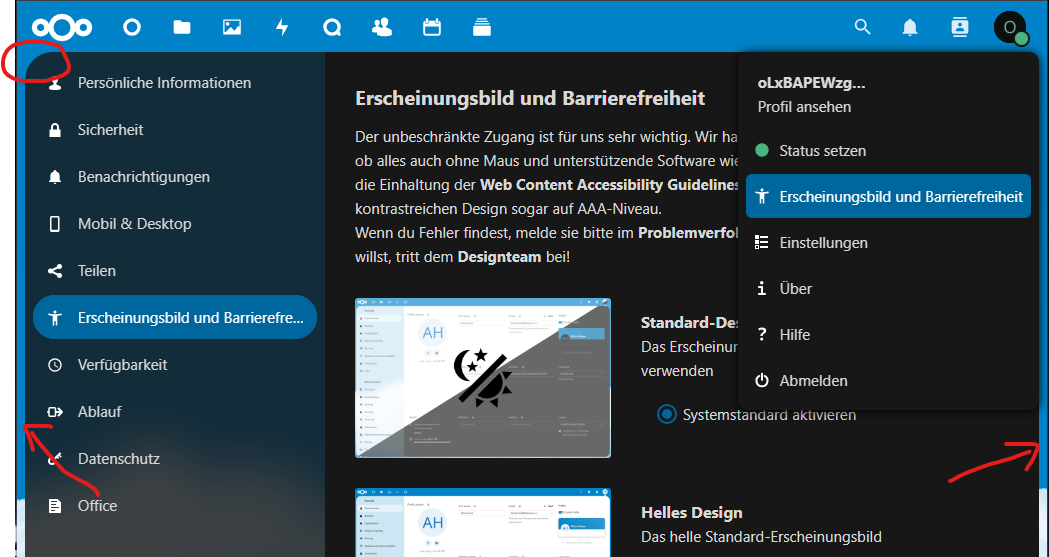
NextCloud has started to make everything there is round. This wastes space pointlessly because the curves need more space.
It’s not the end of the world, but in my opinion it’s simply unnecessary.
If you do that, why do all the elements have a different radius?
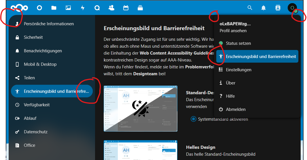
You can see the same thing with the text fields, which again have a small radius:
It’s similar with the buttons. Sometimes there are icons in front of the text, but sometimes not. So far ok, but why is there more distance from the text for some than for others?
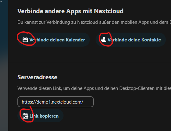
And in this screenshots you can see the different colors. Icons are white, texts are blue. In the follow screenshot you can see a grey icon… WHY?
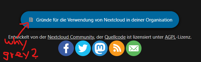
I also find it strange that the text fields don’t have a background color, just a thick border, even though the buttons are all given some color (blue, green, gray…).
Why don’t the text fields also have the same background color so that everything is consistent?
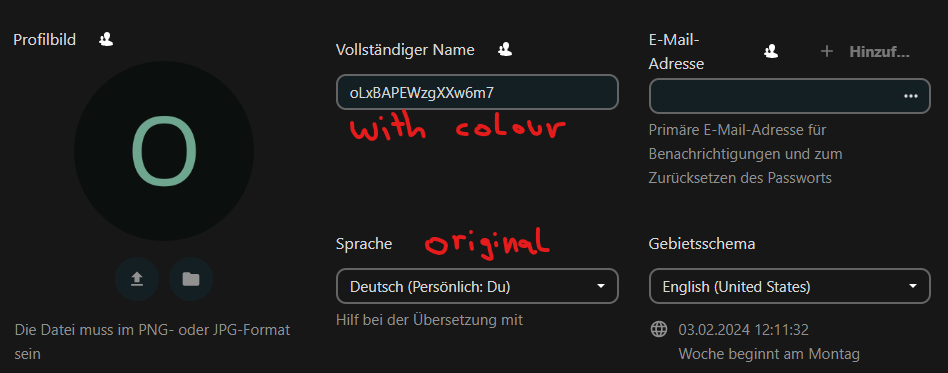
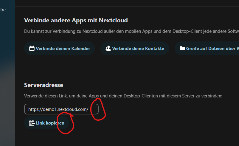
And then the different spaces betweeninput fields. On the same site you can see this:
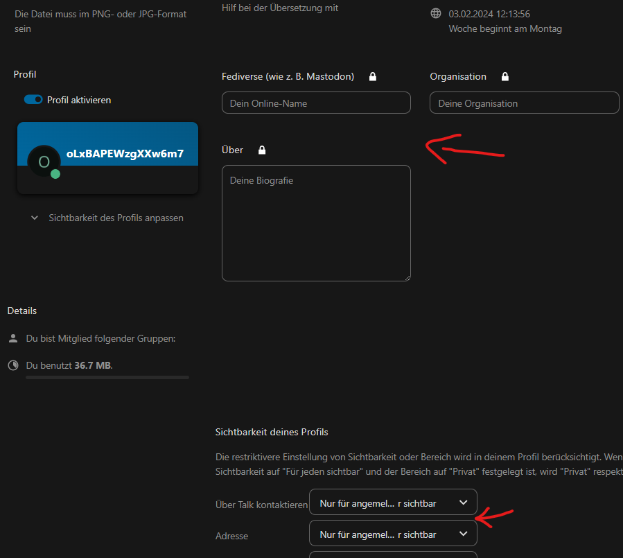
Everything seems thrown together somehow.
Is there a plan as to how this could be set up properly without each page having different formatting?
I could post a few more examples but I think the problem is understood through this.
Who decides which design is implemented and how?
Can I post and optimize the design in GitHub as described above as a pull request or what is the purpose of the takeover?
I have already published a few pull requests that have not been accepted to date.
By the way, this is supposed to be constructive criticism and not hate! ![]()
Thank you!