Is it possible to make sharing easier? I have been given 4 options to share, but as a newbie I am very confused about what is behind each of the 4 options (see screenshot) when typing an e-mail address.
What exactly do you think is difficult to understand? Can you please explain it. You always find a small comment under each function which explains the purpose/differences of the available options.
You always find a small comment under each function which explains the purpose/differences of the available options.
I don’t see it. Also not when hovering my mouse over it or so.
What I don’t understand is the difference between the 4 given options. So I am typing an e-mail address I want to share the document or folder with and then I’ve been given 4 options. One of the options is the full e-mail address with an envelop icon, two of them are the beginning with the e-mail address with the domain name below it (one of those 2 is which looks like a group icon or so and the other one didn’t have an icon), last option is ‘invite guest’. When I compare this to Google Drive for example I got only the option how I want to share the document/folder to the email address (view or edit) . This Google Drive screen / process (see attached screenshot) I did understand without any explanation from the beginning. The sharing screen I attached in the beginning of the thread I still don’t understand.
I hope this makes it more clear too you. I don’t mean it has to look the same as Google Drive, but make it understandable for new users / user friendly.
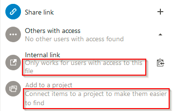
Ok, now I understand. I thought you meant the available functions, which have a short description below the function name, like “Only works for users with access to this file”, and not the displayed search result.
If you enter an email address the displayed result depends on the installed apps/functions and also the matching data from your address book, mail app etc. This might be the reason why it differs from the result which is being displayed on my server and makes you believe that too many options are being displayed.
The envelope usually identifies a found/identified email address.
The symbol with multiple persons on it identifies a group. On my server e.g. only my local groups are being displayed.
The symbol with a single person identifies the function to invite a guest. In this case a temporary Nextcloud account is most likely being created on your server.
Unfortunately, I cannot assign the result without a symbol behind it, because haven’t seen it on my server yet.
Thanks @j-ed for clarifying the options. I think in this case I should ask the server provider. I didn’t know it would be different per server.
With your description I would only expect to see ‘The symbol with a single person’, because it isn’t a group, isn’t an identified email (using it for the first time, I think also no one else at the server would test with adadsdsasd@asasdasdsaadsrandom.tld for example).
Will let you know what my server provider will find out about it. Maybe it could help someone else finding this thread.
I think sharing a pure link or a pure link by email are usually the most often used share functions, because the provided link allows to download files without any further footprint.
The function with the single person symbol most likely creates a guest account (check if the Guest app is installed and activated on your server) is normally be used for advanced file sharing/collaboration.