Hi everyone,
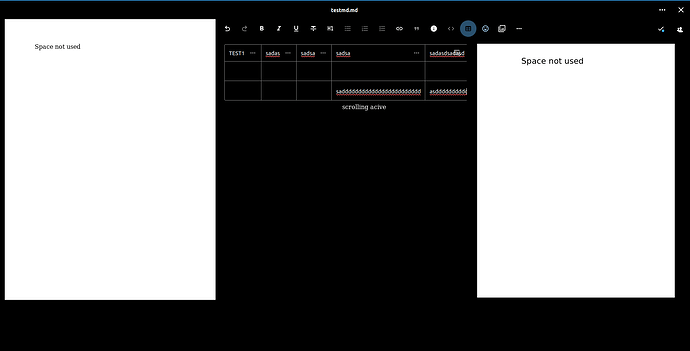
I’ve noticed that in my Nextcloud instance, tables are only using about one-third of the screen width, leaving a lot of space unused. This makes the table contents harder to read and navigate. I’d like to utilize the entire available space to display the tables in full length.
NC: 29.0.2
Observation:
- Tables are only displayed on about 1/3 of the screen width.
- A lot of screen space is unused, leading to truncated data in the tables.
Example: Here’s a screenshot illustrating what I’m seeing:
Questions:
- Is there a built-in way in Nextcloud to adjust the table width so that they utilize the full screen width?
- Are there any settings or configurations in Nextcloud that might control this behavior?
- Has anyone addressed this by using custom CSS, or is there an alternative method?
