Hello there,
Following a poll-based study on Nextcloud users in social activists communities, we at Framasoft (french non-profit) identify some struggles from this user base.
Results will be published soon, and among those was the UX of “Files”. As an instance, some users reports to always going back to “home” because they do not know how to find their ways in Files. Others reports difficulties understanding how their organization was sorting things, resulting in everyone having his owns sorting patterns with no coherence whatsoever.
We have decided that I’ll try to address this issue, and we came up with “Nextcloud Sorts”.
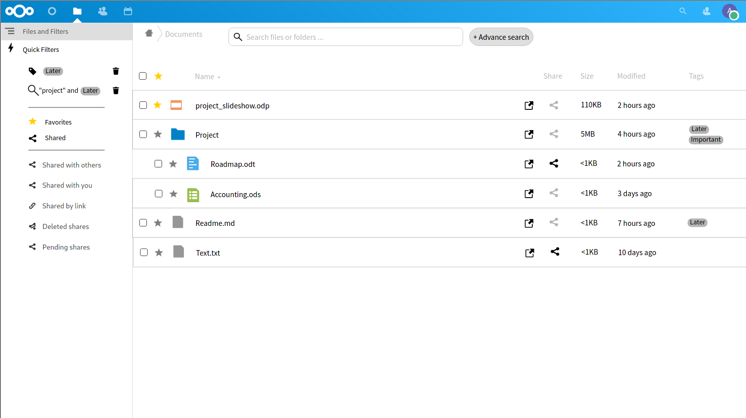
The idea behind this standalone app is to provide a new interface for visualizing the tree of files and folders. Because a list worth 100 paragraphs, here is the scope of this app :
- Provide a better “List view” …
- … with the ability to unroll multiple folders instead of the actual behaviour of diving into folders.
- … with more information accessible from the main view (especially Tags)
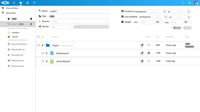
- A (de-unified) search bar which search exclusively into files and folders, by name. (something like this draft : #29614)
- User defined filters (where you can search for things like : all the files tagged “urgent” which are more than 500MB)
- Integration of already existing filters (shared, favorites, and tags)
It can also be seen as a proof of concept for what a future “Files” interface in Vue could look like.
And here is what is not in scope :
- Automatic tagging
- Replacing the Files app
- The scope end up at visualizing things
- no file modification
- no file movement
- no file sharing interface.
A button to open files in “Files” will be provided instead.
The rational is : if I messed up file visualization, my app is just useless whereas if I messed up data modification my app is harmful. Furthermore, I only have 3 month of internship left to develop this, hence a limited scope.
I’ll put a link to a git repository once I’ll have something to showcase. For now I have just made this prototype. Please note : this is just a mock-up. Also, click on “Interactions → show interaction” to see clickable elements (top right-hand corner).
Below, 2 screenshots from the mockup :

-.
I do not have any mock-up for mobile interface yet, even if I should have started with it (“mobiles first”). But I have some clues on how to do it and a mobile mockup might be available soon. (We are talking mobile web browsers here, not mobile apps)
Any reactions and critics are welcome, and if you feel like we are re-inventing the wheel, please do tell us.
RLT (Aeredren),
Intern at Framasoft.
romain@framasoft.org


