Background: I been behind the owncloud project like forever, helping with translations and even implemented it in several .gov organizations, even before the split to nextcloud. Latter I finally switched to nextcloud.
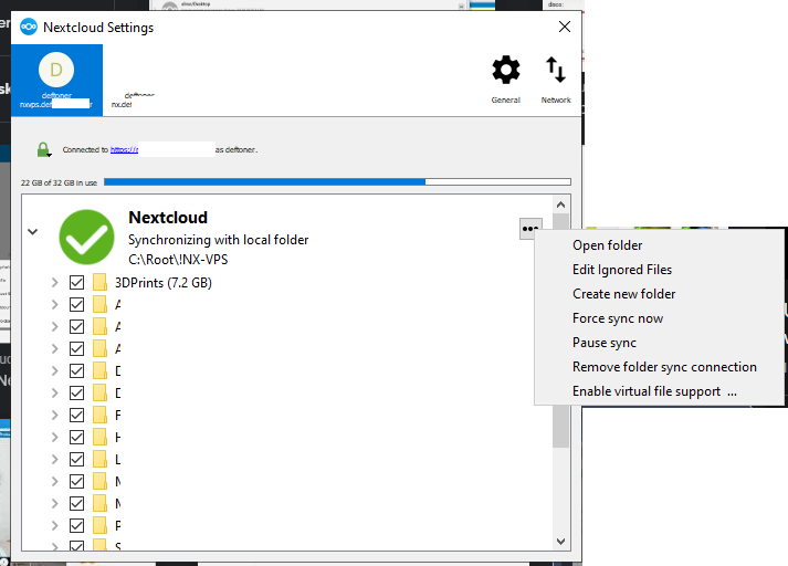
I love the project and I hate that I could help more actively in code since is not my area, but I work in QA, and I can definitely tell you, the GUI design of the windows client is pretty bad.
But lets leave the taste of the graphics for another topic, may be I’m wrong and most ppl love the organization, design and colors of the client.
Lets just talk about functionality. Since day one, the list of notification in windows dekstop client, is been “cut” and there is no place where you can actually read the complete information.
Filename, folders, and even errors are only shown but the first couple of words. And most of them already start with “You Changed…” leaving exactly 20 Characters to show the complete path of the file. Making this notification almost useless.
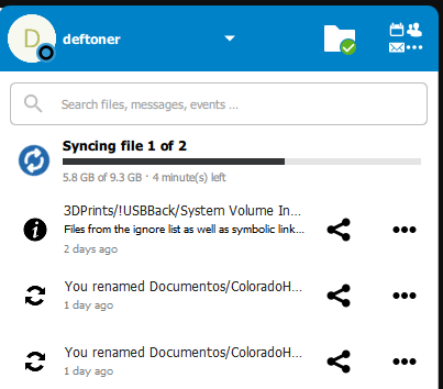
and the 3 dots / view activity, always takes to a blank page. I have 4 servers, and countless clients, and is the same in all of them. This make the “notifications” incomplete, lack of information and in some cases useless.
Would be good to add a “clear” button? may be?
Also the main client GUI wont obey the the windows font scale (again happened in several “high resolution” desktops)
This is like, you know, my opinion ![]()
I’m in eternal respect with the project and everyone involved in it. I have an endless thanks, and in my way I tried to help and I put the word out there too.