I must be blind, but I have searched the Talk setting, the convo settings, the admin app for talk settings, but I can’t find how to get rid of this front/landing page thing.
I just want it back to how it used to be (it used to just open whatever conversation it was left on last i think).
Well its just a mess, it has no functionality (not for me). Iv had some of my family contact me asking what it is and why its suddenly appeared and why “I” added it, and then how to get rid of it.
Personally i could get rid of it via a browser .css addon or custom .css file without problem but i can’t do that for family members without a lot of hassle.
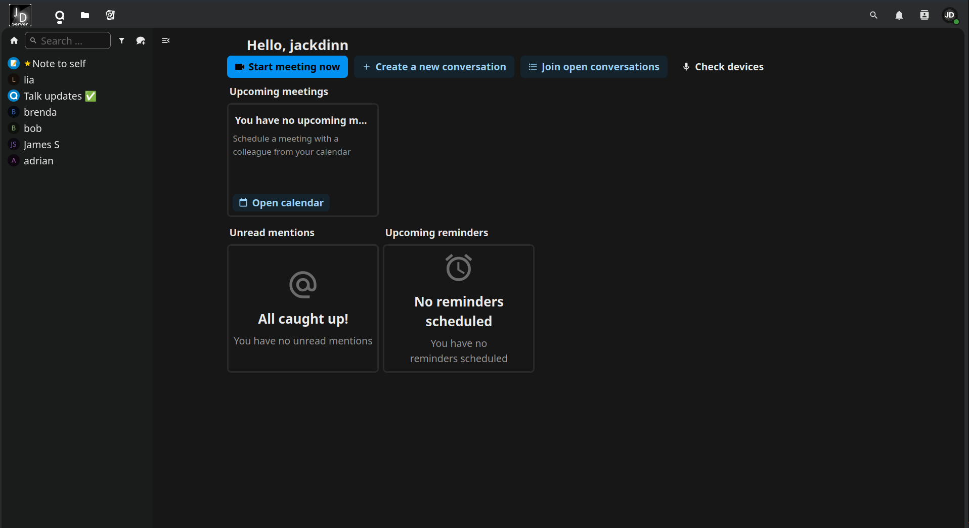
Ah, well that would be 100% improvement over a page of odd buttons and widgets that i will never use or need.
We just use talk to message and voice/video chat, no calendars, no meetings, or reminders or any of that stuff.
It just lead to non techie family having no idea what this page was, no idea what any of the buttons/widgets were. Just an unsightly extra page of confusion for them.
EDIT:
All other landing pages that I’ve ever seen are built, designed, and organized by the admin. Like the Nextcloud front page thing (that I could at least completely remove). Point being that these kind of landing pages are usually under the control of the admin. You can add the button/widgets that you want or remove the entire thing. I don’t like being forced to have this thing come up every time i load the browser talk.
Are your users accustomed to opening meeting invites from the calendar as the only way to get into them? Did they not have the ability to create new calls/meetings?
So users just open the app, select someone else (or a group) and launch a conversation? I’m just trying to understand your normal workflow. Wondering if there may be a workaround for you.
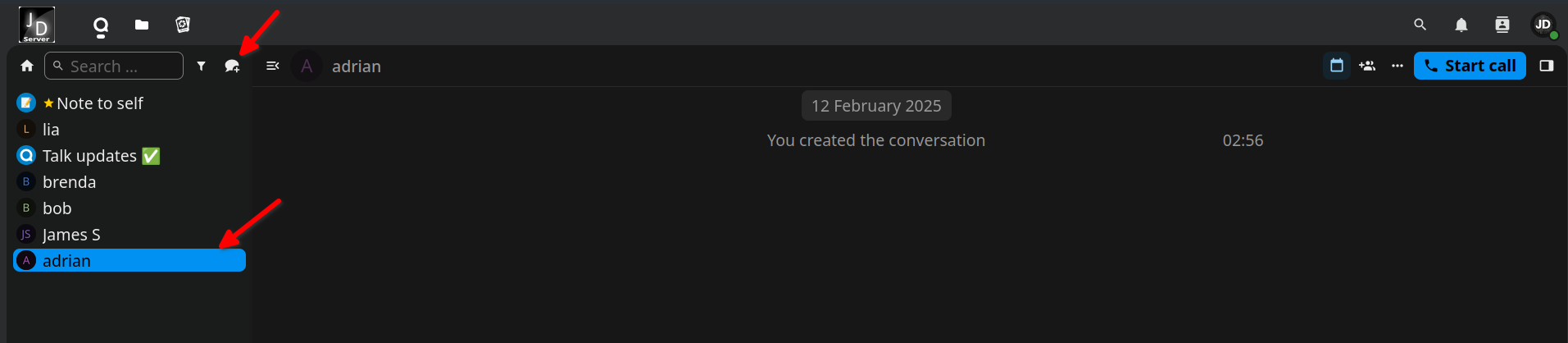
If the users are on their computer then they have a shortcut directly to the talk (spreed). It opens, they click the already open conversations on the left with the individual who they want to continue to talk with (or whoever is talking to them).
They can create new conversations or group conversations with use of the icon i highlighted, but mostly we just use the already open ongoing conversations.
We all have the “Start call” button up there on the top right, its all self explanatory really.
Its all much the same if they are using their phones, They run the talk app and select the conversation they want to talk in, exactly the same.
Now however, when on their computers, the first page that they all land on is this new landing page which i personally found unnecessary and the users were confused what it even was.
They will just have to live with it being the greeting page when they first open Talk.
P.S.
They all mostly use their phones anyhow (Talk app), and as that does not (thank god) have this new landing setup its all ok. Lets hope it stays that way
Yea it would work but they would have to have a separate shortcut for each person that they talk with. We don’t want that, just a “Talk” icon on their desktop or wherever it is all they want otherwise its just confusing & untidy for them them.
Can each person navigate on their own PC to that page you showed above, and simply bookmark it themselves? That way they would see only the people and/or conversations that they themselves have set up or been a part of.
No. That page i showed above was after selecting one of the conversations (adrian). This user would have to have a shortcut for each of the other users/conversations if they wanted a shortcut directly to each of the other users. They would have 6/7 Talk icon shortcuts.
I too have noticed the change and thought it was interesting to see. It does give me a glimpse of what it can do otherwise I would never have known about it. I agree this screen should be a choice to be viewable by the user or not. I would leave it as default so they know what’s there.
I did briefly take a look at the Docker files, just to see if I could find where the .css or html that controls the loading of that particular page is, to see if I could change it.
Unfortunately i couldn’t and did not want to poke around to much. So i left it before i broke it ^^.
And yes, the only real issue with the new dashboard, if you can even call it an issue, is that it’s not customizable. But that might something they could still add in the future. I think it would be great if it worked more like the main Nextcloud dashboard. For example, if the “upcoming meetings” widget disappeared or wasn’t available at all when the Calendar app isn’t installed. But again, that may be added in the future.
At the end of the day, though, this is really just nitpicking at a very high level. All that’s been done is to fill an otherwise empty space with a few helpful widgets and buttons, which appenarntly not all users find equally helpful. Still, none of the existing functionality has been removed or changed, and everything can still be done exactly the same way as before.
Feel free to open a feature request on GitHub. Ideally, it would include specific suggestions for improvements, or in this case, what exact customisations you would like to see.