Enshittification

I have no support/technical question and have seen the support category. (Be aware that direct support questions will be deleted.)

on

Which general topic do you have

I really love using Nexcloud, right from the first beginning with its emancipation from Owncloud. I love the progress it made, the thoughtfullness the developers showed in so many aspects.
But this love begins to crumble more and more. Especially when I am using the web interface, which I do quite some times a day.

  • It started with the round corners, they introduced one dark day. They annoyed me each and every time by wasting so much space on the screen, especially on small screens, and I was glad to see, that I was not the only one. Somebody eventually introduced an app, ‘unrounded corners’, to remedy that. OK. Sad enough, that you have the declared option in Nextcloud to ‘customize’ the look-and-feel, but so basic issues are not adressed by that.
  • Later it went on with me having to enter my password when I wanted to update an app. Seriously? Why am I logged in as administrator?
  • The last issue, or rather bunch of issues were introduced with version 34:
  • Big search Button, pretending to be an input field where I could directly type in. Again: seriously? Do you really have to fool your users? Do you really think, they are too dumb to find a smaller search if they would want to? As I read from many of the comments here, there are many users out there who don’t use the search function at all or very rarely, since they already structured their stuff in a way, which makes everything accessible at once. And seriously, If I search for something, I don’t find it really helpful to get a bunch of results from all categories and have to search within the search results …
  • This fancy, ‘modern’, ‘goodlooking’ new Extra-button menu called ‘waffle’ as I meanwhile found out. From design-aspect it looks good, clean and exactly like google-stuff. But from usability it is far away from any improvement. Each and every switch of apps now doubles the clicks necessary for that. For what benefit? I have about 24 apps installed, and I use 5 external sites, which I put into the top bar to have them accessible. And that was no problem for me at all. What problem should be adressed by the waffle menu? By the way: accessability. In the settings of Nexcloud there is an item: Accessibility. All you can do there is changing the colors of the theme. But “accessability is very important for us”, as you state.
  • The notifications about updates for apps or system in the notification area and in the android-client app now don’t take you to the related update-screen as before, you now land on the ‘main app’ defined in the settings and have to navigate to the updated yourself. Neither useful nor accessible.

If I read the comments here and in github there are quite a lot complains about these renewals, especially about the way there are introduced: “There! Take it and live with it!” This is exactly the spirit which drives people (including me) away from Microsoft and Google. What about “Here is a new option, do you like it?” I thought Nextcloud was proud of their way of thinking different, why are they now copying all these bad things from the major players?
I really have the impression, that meanwhile most decisions are made by the sales-and-marketing department, and users are not welcome any more. Apparently decision-makers from big companies are the new target audience.
Sad. I have to search for a new solution again.

@dbielz if you’re unhappy with upstream decisions, do something about it :+1:

no need to rant here :cat_with_wry_smile: on the community forum, but don’t worry you’re certainly not the only one who’s critical

https://help.nextcloud.com/t/ui-is-for-users-waffle-menus-are-for-diners

some folks have made some good suggestions: Option to use Waffle menu or links displayed normally ¡ Issue #61274 ¡ nextcloud/server

now this is positive thinking :check_mark: → https://help.nextcloud.com/t/how-to-have-multiple-apps-visible-in-nextcloud-34

some folks care and take matters into their own hands instead of complaining → that’s the community way, that’s FOSS, so join in and make things happen!

What exactly would you suggest how to implement a new design/feature? You will always have people that are unhappy with, and having everything optional that you can switch on/off is not possible for everything, what is a good criteria? Like you did come with usability and user experience is one good point. Looking “new” / “modern” / “fresh”, you don’t want to have a web-interface with a design from the 1990s just because people are used to it.

I don’t know for each of the cases how far you can get with just theming or individual apps, scubamuc pointed out an alternative for the menus. However, this is something that needs to be maintained afterwards.

For me the best way to interact and getting feedback to the developers soon is when the stuff is still in development (beta-versions/ release candidates). Then you see also what the reason behind a feature is, if that is just a thing of modernity or if there is also a more functional reason. This way, you get much more context, your arguments are heard early in the process when it is easier to change things.

Every new feature should solve a specific problem and not just change the UI for the sake of having something new. Yes, personally I can understand, that a design team wants to improve the visuals as well - but having a new design is not always better.

It would help, if new features would also be explained somewhere to help understanding why the change had to be done. And the explanation “we like it better this way” is not always the best answer :wink:.

As a generic example, not specific for Nextcloud:

When CSS was introduced, it was also possible to remove the underline text decoration for links. However, links are usually recognized by being in a different color and underlined - and this is also accessible, because just having a different color alone may not be enough for some people.

So removing the underline should only be done for very specific use cases like menus, where users expect every item to be a link anyway. But inside a regular text, a link should still be underlined and not just in a different color. But many websites started removing underlining for every link and making the design less accessible. So “looks better” is not better in this case.

And about specific features in Nextcloud:

1) Rounded corners

What problem is solved by having a margin with rounded corners around the main content area inside a browser window? Is this more accessible?

To me this is mostly a matter of taste. But objectively the usable space inside the browser window was reduced by this decision and on smaller devices which only provide a viewport of 1280px by 720px or less this is a real issue. Also apps had or still have visual problems with the rounded corners, since they were not designed this way or he design does not fit well to the rounded corners, like scroll bars which extend into the corner and just look “odd”:

image

However changing the design to move the scroll bars more towards the inner area, so they look more “natural” fitting to the rounded corners would reduce the usable space even more.

Yes, the design can be change using Custom CSS but since this is more or less just a global CSS rule and only needs a few lines of code to disable this, having an option for this in the theming settings to decide wether you want more usable space or prefer rounded corners, is not even a big technical challenge. Having custom apps to do that always comes with the risk, that the app is not supported any longer in a newer Nextcloud version.

2) Putting labels inside the text fields

At some point, someone decided that it is a good idea, not to have labels to the left or above of text fields, but instead to be displays inside the field and move them to the upper border and change the font of the label to a much smaller size, as soon as you start typing something.

What problem was solved by this? The old solution of having a label with a readable font size always visible was accessible and works for everyone. Just because Google and Apple decided, this looks “better” does not mean that it is better. Also the way how Android

3) Removing the toolbar as it existed since the very first version of Nextcloud

From the very first version of Nextcloud there was a toolbar which allows to access all installed applications with a single mouse click. In the case, not all icons fit, there is an overflow icon which opens a drop down menu.

First this toolbar was limited to a specific maximum number, regardless how much space there is. This was a problem and the solution was to allow the whole space in the toolbar to be used, so there will be as many icons as posible.

The order of apps was also important - most important apps should be first in the list and the user should be able to determine the positions. Solution: allow to change the order of the apps, which is even possible individually for every user.

But what problem was solved by removing all apps from the toolbar and introducing the waffle menu and a “fake” search box? Did users really not find the search icon on the top right corner? Was there a user survey? Are there many requests by users to have the search in the middle of the toolbar as big element, because most users need this all the time to justify this change?

For specific issues, you can check or create issues on the bugtracker, especially if the user experience is bad or accessibility is affected.

Just because you mentioned the search, they are planning a redesign later this year:

And with the design-tag you can find all the design-related topics:

Fun fact: This was the direct menu app, that was integrated natively in NC 12 (Welcome to Nextcloud 12! - Nextcloud), before it looked like this:
Google Image Result

And this is actually a nice development, because it was an optional app and it just became so popular they made it the default.

On github they discuss new features, so it is more the developer community participating there but others are not excluded.

Keep ranting. The notion, you should ‘Go log in somewhere else’ in this compartmentalized purposefully obtuse absurdity is yes ensh!tified snobbery.

Software SERVES the END USER not a DEV’s desire to cram the latest Shiny-bell-whistle.

I agree wholeheartedly with everything you wrote. Having to re-enter your password repeatedly while being logged in to admin the system is reminiscent of Clippy circa 1999 'It looks like you’re writing a letter." annoyance.

Yeah well, but, development happens on GitHub, so if you actually want to contribute in a productive way—which, to be honest, doesn’t really seem to be the case—then that’s the right place to do it. If not, that’s fine too. But ranting here definitely won’t achieve anything.

Yes, but ultimately, It’s also a product that you can choose to use—or not. And in this case, it’s even available free of charge.

To be honest, this level of entitlement that I’ve been seeing in parts of the Linux and FOSS community is becoming increasingly frustrating. People show up in community forums just to vent their personal frustrations because nobody is building exactly the product they want, with precisely the UI, the corner radius they prefer, the icon colors they like, or whatever other highly specific preference they have. Ideally, they also expect it to be free—or at least extremely cheap—and come with 24/7 personal support and hand-holding.

And it’s actually much worse than just people feeling entitled or venting their personal frustrations.

It goes way further. A lot of people, and apparently you as well (considering you’ve decked out your profile in the full libertytalk.fm style) are misusing the FOSS community to promote their own agendas. In doing so, they’re undermining one of the last communities that still has a meaningful connection to the original ideals of liberty and freedom.

But sure, keep it up. In a few years, you won’t need to worry about having a waffle menu or any other type of start menu anymore, because AI assistants from OpenAI, Anthropic, Microsoft, Meta, Google and so on will take care of everything for you.

Anyway, rant over. Turns out I can rant too, you know. :wink:

I would suggest to adapt that approach from big players, which makes you feel welcome with their way of treating you as user: major changes, especially in the user interface, where they substantially change your way of doing something, are introduced as option. Optional, as the term indicates, which means: you have the choice to adapt it or not.

You’re absolutely right, but this argument has two sides: just because a functional and well established, tested and proven design is “old”, is no self-sufficient reason to make it new, just because people are used to get something new every now and when. Especially if the ‘improvement’ costs usability.

Well, there are some web apps out there, like piwigo, xwiki, or webtrees, which have a skinning mechanism built-in, which lets you use totally different skins, making the same site looking totally different in the complete design, beginning from fonts, button design, etc. up to the very fundamental organisation of the page structure, just by switching the skin. They all work with php, so this appears to be no technical barrier. This would be the place where I would expect such new options to be found and to be activated or deactivated, if they don’t work out.

Again you are right. But unfortunately I have a real life besides my digital life, and within my digital life, every single app and piece of software I use is only one out of at least 50-100 different tools. In private life, not to talk from my work life as adminstrator. So which tool should I pick out to follow the development from the very beginning of planning something new, just to be able to interact with the progress of development?

And by the way, as already @awelzel said, I just would prefer to say it in other words: every change, every modification should be an improvement of the state being. Of course for the user, but not only. It should generally should make something better than before, otherwise it brings up the question: is it worth the effort, just for being different from before? For me it’s simply a matter of self-respect: If I put effort into something, it should always have an improvement as result, or at least no regression in any other aspect, otherwise the effort is not well-spent in my eyes.

Yeah, that’s where I started couple of days ago. I also saw, that somebody introduced a new app as a remedy for this problem. Apart from this I could hardly identify a statement from somebody responsible for this waffle menu.

Seriously? The not only accepted but even suggested approach is to develop or install a new app as a remedy for every design change that makes previously existing situations regressing? More apps to update? Every single update with individual password confirmation? More apps introducing potential problems? Just because some developers can’t admit that they tried something, and it was not as brilliant as they thought first? Or that they overlooked substantial aspects like usability in their modification?
Come on guys!

It’s not like this stuff is done in secret. Jump in!

Feedback/collaboration/experimentation is encouraged. Things evolve based on field experience, continued discussion, submitted experimental design changes, etc.

And the channels are all quite transparent:

There’s nothing wrong, of course, with discussing/asking/proposing changes here on the forum. Obviously the forum is read by many involved in development and design too. It’s more that direct change comes from participating in the actual design/development. And there are established channels where that work happens.

Where are you getting this impression? v34 has been out for<60 days. Things will continue to evolve. They already are. However, generally speaking, unless you install development branches, you won’t see major UI changes until the next major release (unless something is really really wrong; since existing major releases - i.e. v34 - only receive bug fixes not wholesale rewrites once published).

Also, expect to always experience newer stuff like this in whatever is the the latest major (v34 currently). That’s what it is is for!

If you want fewer surprises/the most maturity, use one major version back (always actively supported for at least 12 months: devs spend time backporting bug fixes and troubleshooting problems in it – which is why it gets frustrating when people complain about problems with the latest bleeding edge major release as if they are insurmountable).

I realize a few items have been mentioned in this thread that aren’t v34 specific; great, provide the feedback. Post here (like is happening in this thread). Post on GitHub. Heck, post on the subreddit. Whatever. I know for a fact there are Nextcloud project members - real people - across all of these channels. People do read this stuff. Half the reason I hang out on the forum is to look for recurring patterns and early signals about hot spots. If I happen to have capacity, sometimes I’ll contribute somewhere to nudge things in a particular direction. If other project members happen to agree with my nudging, it gets merged (whether we’re talking code or doc changes).

That said, not everything is black and white. Not everyone is going to agree about everything or have the capacity to think through all aspects all the time. Or there may be other challenges. Or competing priorities or goals. Or maybe someone just hasn’t stepped up and tried making the change yet.

No worries if you’re too busy to do more than provide feedback. I often am too.

Feedback is great. Just try to remember there are real people on the other end of it. We’re all busy AF too. :wink:

Also keep in mind, that the end of life for Nextcloud 33 will be 2027-02, so you can still stay on that version for another 7 months, before you have to upgrade to Nextcloud 34. Until then things may also change as well.

See Maintenance and Release Schedule ¡ nextcloud/server Wiki ¡ GitHub

There was a reason that Nextcloud split. Maybe it will happen again.

Seems to be a pattern in the new ‘private’ equity [read: corporate welfare] business models of the day.

Release a community self-hosted version, data harvest from & ignore the user base. Same thing happened to RocketChat.

Have chosen to use it for a decade now and watched it become ever more bloated. Maybe I am just tired of 'one more login. But keep coping.

Why do you keep regurgitating something false? Have already stated, more than happy to pay money, merely for access to the documentation.

What I am not willing to do, is pay $5,000 dollars for said access to documentation.

I don’t know man, rather enjoy the avatar. It reminds me of the Rebel Alliance.

LMAO ‘misusing the FOSS community.’ Yea using an SMB identity to poison pill and disperse data points across big tech algos ‘misuses’ the FOSS community how?

I dare say your type of demeanor is precisely the type that has kept People from moving over to Linux & open source software.

Failing to serve the market, is how you go out of business. Ignoring feedback from decades-old users who provide insight to how the the product is implemented in actual workflows not all the bright.

Well unless of course you are IBM and get handed $2 billion in tax dollars.

Malo periculosam. Libertatem quam quietam servitutem.

Thanks for encouragement. As you can see, I’m not very keen on this kind of discussion, but the developement discussed here was too essential for me to let me stay quiet.

Well, quite frankly said, I am simply surprised to see these ‘improvements’ again. Again, because they all remind me on something I already met before and that has been rejected after a while because it didn’t prove:

  • The rounded corners are very familiar from Windows XP’s Plastic-Look-and-Feel, so absolutely nothing new. So, every time I look at Nextcloud (and this board :blush: ) it always makes me feel like 2001 again and I wonder who in the Nextcloud team regards this as any kind of modern?
  • Hiding Controls is wide spread in software meanwhile, it reminds me on the trend in modern cars introduced by Tesla and quickly followed by other manufacturers, to hide as many buttons and controls as possible behind a menu which is behind a touch interface. There they meanwhile found out, that this is terrible usability and are reversing the trend already.
  • Asking for passwords as often as possible apparently is considered superficially to be more secure, but meanwhile the security guys stopped recommending such pseudo-secure things like ‘change your password regularly’, because they found out, that if things get too complicated for everyday usage, they are increasingly avoided by users. So in this case I also start to think about 'do I have to do this update or would I rather wait the next couple of updates, until I have more time. Or desire for doing this. Or whatever.

These are just the major issues in the recent development of Nextcloud, that are bugging me. I mean, why reinvent the wheel? Why repeat not-so-good things, that already were tested and rejected? Okay, maybe some of the developers are too young to remember Windows XP, but the other things? I mean, why do you polish design in general? Presumably because you want people to be animated to use your product more, and not to look at it, admire it and move on, or am I wrong? Of course, design is merely a matter of taste, quite subjective. But as usability is concerned, things become objective. And a new design which is looking better but is making usability worse, does that make people use it more?

:grinning_face_with_smiling_eyes: yeah, thanks, I also thought about that, but downgrade is not supported in Nextcloud. And restoring a backup after a couple of weeks would mean data loss for my family and me …
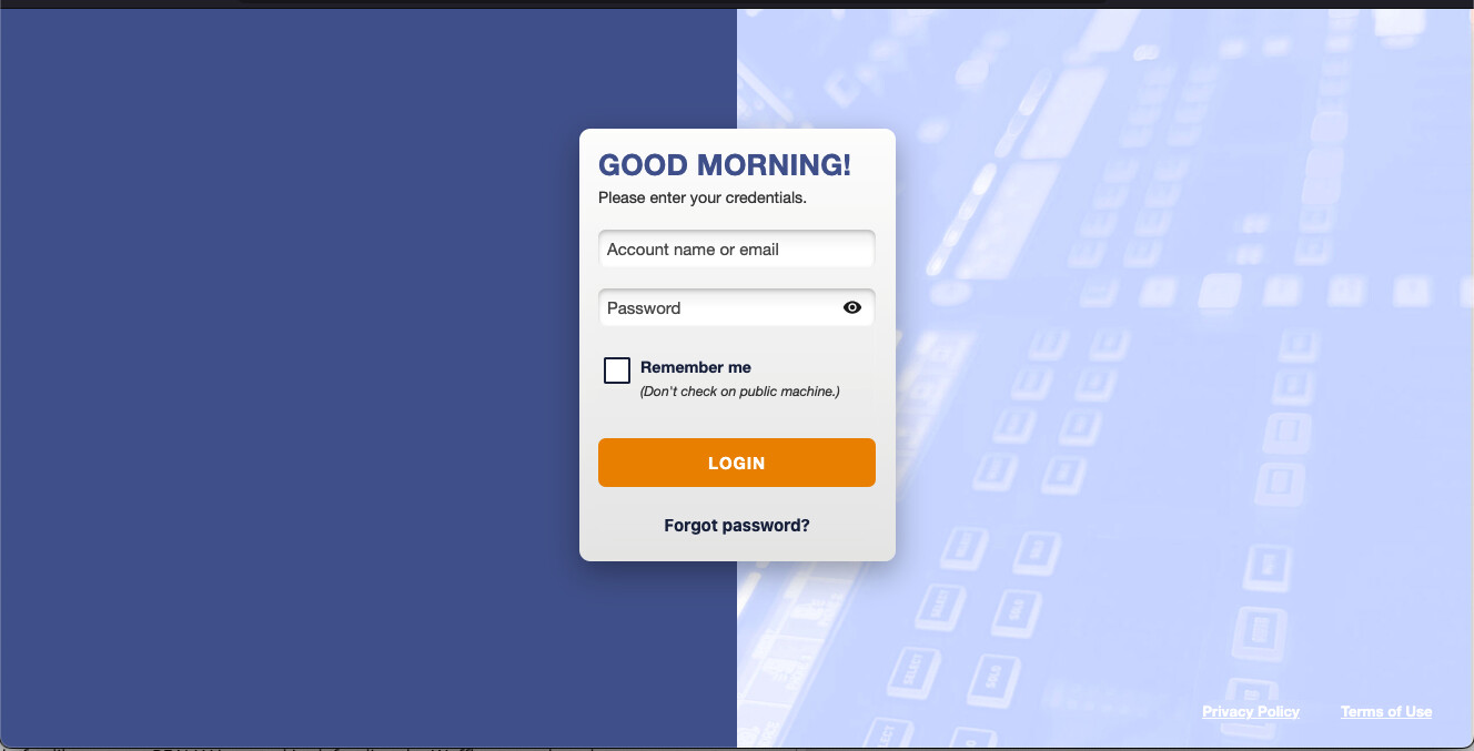
Maybe. And while I think that should be the last resort, that’s actually how FOSS is supposed to work, and it’s not necessarily a bad thing.

What people should do first, in my opinion, is provide constructive criticism, open well-reasoned GitHub issues, contribute code, or otherwise participate in the development process.

A good example is what @awelzel has been doing: providing concrete examples and thoughtful, detailed feedback. I don’t always agree with everything he says, but at least it’s constructive and gives the developers something they can actually work with.

However, if that doesn’t lead anywhere because the goals and visions have simply drifted too far apart, then creating a fork is a perfectly legitimate way to pursue a different vision. In cases like that, there isn’t always a clear right or wrong, just different goals and different visions, both of which can be valid.

What you can’t do, however, is force the existing project to adopt your ideas. In the end, it’s their project, and they get to decide which direction it takes.

I can understand to some degree where you’re coming from, but I don’t think that’s actually true.

Even today, you can still install a very minimal Nextcloud instance that is used only for file sharing, or one with just the Calendar and Contacts apps. You can run it on a simple LAMP stack, without FastCGI, and even without a dedicated database by using SQLite.

If you’re using it just for yourself or your family to sync files, calendars, and contacts, such a setup still works just as well (or just as poorly, depending on your perspective) as it did when Nextcloud first appeared nearly ten years ago.

The fact that Nextcloud has gained many additional features doesn’t mean you have to use them. Most of them are optional, and you can still keep your installation relatively lean if that’s what you want.

Fair enough. But honestly, why not be glad that you don’t have to pay at all, and that Nextcloud funds its development through larger organizations while releasing everything as FOSS? The entire community benefits from that.

Also, why would you need access to the enterprise documentation if you don’t want to use any of the additional features, or “bloat” as you called it, in the first place? All the information required to run the Community Edition is available in the public documentation.

And if you’re hoping for some kind of extensive theme editor that allows you to completely undo the new Start Menu and customize every little detail to your personal preferences with just a few clicks, I’m afraid I have to disappoint you: such a thing simply doesn’t exist.

What you see with large customized SaaS offerings like those from T-Online, IONOS, and others is a different situation. Some of them are still running older versions (LTS versions), and they have dedicated development and operations teams that customize their instances, maintain patches, cherry-pick changes, and so on.

Yes, that is obviously not feasible for a typical home user or small business. But it also wouldn’t be sustainable for Nextcloud if they offered that level of customization and support for €500, because then companies would simply pay €500 instead of buying the €5,000+ support and enterprise offerings that actually fund the project.

So even if you could pay €50, €100 or €500, or whatever amount you consider reasonable, not much would actually change. You still wouldn’t be able to customise your Nextcloud with just a few clicks. You wouldn’t receive LTS support or suddenly have the power to demand the implementation of a specific feature sooner or significantly more influence over the direction the project takes.

The main difference would simply be that you would be financially supporting the project.

However, Nextcloud GmbH has chosen a different business model; they generate revenue from larger organisations. This is a perfectly legitimate strategy, and quite possibly a more sustainable one in the long run.

If that continues to work out well, which, so far, it seems to be doing, then it’s actually a win for the community. We get to use the software for free, which I’m perfectly happy with, while there is likely a better chance that the project will continue to be actively developed over the long term.

Of course, that’s just my opinion.

And again, if your vision of what the product should be is fundamentally at odds with the direction the project is taking, which is perfectly legitimate, then in the end your only options may indeed be to use something else or start your own project, either from scratch or by creating a fork.

With Nextcloud, though, there’s also a middle ground: Apps.

Many apps exist because someone wanted functionality that wasn’t part of Nextcloud or wasn’t happy with how something had been implemented. Custom Menu is a good example.

Also, quite a few community apps have even been adopted into Nextcloud over time. If I rember corretcly, App Order has originally started as a standalone community app because someone wanted to be able to reorder the app icons.

So my bottom line is this: I’d rather see people take a bit more initiative instead of constantly complaining about what others are doing wrong and immediately shouting “enshittification” every time a project doesn’t do exactly what they want.

Because if everyone only complains and nobody contributes anymore, then one day there really won’t be any FOSS projects left. And that is when you’ll get actual enshittification. At that point, the big tech companies will be making all the decisions for you.

But hey, at least your wish to be able to pay for it will finally come true. :wink:

EDIT: Added a reply addressing the specific point about the enterprise documentation.

The reason was, that the company behind OwnCloud did not want to release every feature as part of the free version. Instead, OwnCloud became a freemium model - you can use basic features for free, but if you want to have all, you have to pay for it. That’s why the founder decided to take the free parts of OwnCloud and create his own fork. And until today, Nextcloud is completely free and you can use all features without paying for it.

However, back then, OwnCloud was way less complex than Nextcloud today and had much less applications available. Today you would not only have to fork a huge project but also convince all the app developers to support your fork as well.

The developer community behind Nextcloud and it apps are already 243 people - and these are just the people registered as Github community member. There are many more who just did not request a community membership.

Users who use Nextcloud for free are not a “market”. You don’t sell anything. And organizations who are paying Nextcloud GmbH for an enterprise license, can of course request support and even changes in the software.

And on the other hand also big players like Google or Microsoft do not provide products which fit everyone. But it is enough to provide something usable. And this is not defined by “everybody loves the UI exactly as it is” but as “it is useful for many people”.

And in the end you are always free to take Nextcloud as it is and create your own version with all the modifications you like. And using Custom CSS you can easily modify many aspects of the UI as well to fit your needs - also see my HowTo article.

Where do you derive such a conclusion? No one is forcing anyone to do anything. Coercion is a tool of the STATE. I am merely a market participant providing feedback.

They can either listen to the GROWING chorus of people who are getting fed up or choose not to and write it off as meaningless. The history of business is replete with those who chose to do the latter. in fact Linux & MacOS are enjoying another gain in popularity thanks to Redmond perpetually standing on that hill.

I do feel like you are REALLY invested in defending the Waffle menu though as you seem to show up on EVERY post that dares make mention on what a turn off it is. Did you have a hand in design/implementation?

Nah, I’ll just alter the code as necessary to accomplish what is within my abilities.

Unfortunately, altering the welcome, password reset and other email templates that survives upgrades is behind the Enterprise paywall.

For the sake of clarity, I am not interested in their hand holding, I merely seek the Information, you know that whole promise of the Internet liberating information, really sort of glomed on to that principle.

Yea actually if you have ever read Mises and Hayek you might understand yes the People who make use of your product ARE part of the market. You don’t have to have a proof of purchase to be ‘part of the market.’ You ever listen to a radio station? How much did you pay to that commercial radio station to be able to listen to them? Think a program director doesn’t take feedback from their local listener community seriously?

Well guess if you are an automated private equity station run by machine sans Humans perhaps it is safe to ignore the People, until it ain’t.

You play Hip-Hop day in and day out in an area that hates hip hop, advertisers stop advertising, stonK price drops, and Mr. Regional Director of Automated Broadcast be out of a job.

Yea same as RocketChat is doing.

So go for it man, pedal to the metal. Ignore the users who helped you test what eventually became a commercially viable product. Seems contrary to the founding sales pitch but OK. Have at it.

Yes, but that’s exactly the kind of customization that SaaS providers can use to build commercial offerings without contributing back to the project. And for most home users, it’s not something they really need.

That said, I do agree that smaller organizations could make a reasonable case for having access to those resources as well. The problem is that if you make the documentation freely available, nobody will pay for it. And if you offer it at a much lower price, then larger organizations will naturally choose the cheaper option too instead of paying for the enterprise offering.

I think the current approach is a reasonable compromise, even though I don’t have a perfect solution either.

Also, Nextcloud actually puts very little behind a paywall, and none of it limits any actual functionality. Other so-called FOSS projects put features like OIDC or even 2FA behind a paywall. Nextcloud doesn’t.

And, to be honest, I can understand that they want deployments using the free Community Edition to remain recognizable as Nextcloud. They don’t actively prevent you from changing the branding, but they also won’t actively help you achieve it or provide official support or documentation for doing so.

Again, that seems like a fair compromise to me.