Sorry for the harsh reaction - but please try to understand it anyway.
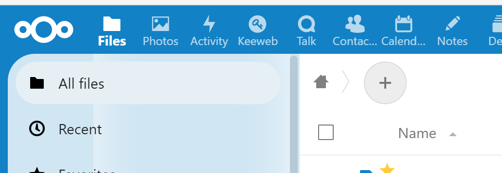
I just installed the update to NC 25 and realized that the whole UI now as big round corners?
What use do these rounded corners have?
Even in apps like office integrations or calender with a scroll bar at the right side there are big round corners which even cut off the scroll bar!
Also why the background image? What use does this have?
Also why does the main content area have margins around it? There is absolutely no benefit from that. This way only space is wasted for exactly nothing.
And no - just because smartphones have displays with round corners does not mean that a desktop UI should have this as well.
And no - using rounded elements all over is not “modern” or “more usable”. It’s just a “fashion” statement and nothing else.
Fortunately using the custom CSS app most of the design changes can be reverted. But please consider at least an option to disable rounded corners and margins around the main app area below the top toolbar. Nextcloud is a tool for productivity and not a graphics design tool or video/game platform!
Edit:
My CSS fixes so far (updated 2022-10-21) - these also some fixes or the integration apps for OnlyOffice and Draw.io as well as a little bigger default font for the Text Editor app (regular text should not be smaller than 1em or 16px):
/* Disable the rounded corners for the main content area and certain elements and margins for the main content area */

#content, .content {
  border-radius:0 !important;
}

input, textarea, select, .multiselect__tags {
  border-radius:4px !important;
}

#content, .content {
  margin-left:0 !important;
  margin-right:0 !important;
  margin-bottom:0 !important;
  width:100% !important;
  height: calc(var(--body-height) + var(--body-container-margin)) !important;
}

/* Fix visual glitches with navigation area without background image */

#app-navigation, .app-navigation {
  backdrop-filter:none !important;
}

/* Remove mouse events from quota display in file manager
   since selecting that element does not do anything */

.app-files #quota {
  pointer-events:none;
}

/* OnlyOffice with correct height */

#app > iframe {
  height:calc(100vh - 50px);
}

/* Draw.io without scrolling of the app area */

.app-drawio > #app-content {
  overflow:hidden;
}

/* Custom styling for markdown editor */

.text-editor__wrapper div.ProseMirror p {
  font-size:16px;
}
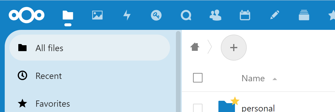
This app does not solve the issue. In addition I found even more visual problems like lighter shades appearing in the left navigation area when hovert toolbar icons or selecting files in the file app.
Example - when I hover the “Files” icon suddenly a light shade appears in the navigation area below the icon:
I already opened my post with “Sorry for the harsh reaction - but please try to understand it anyway.”.
I am well aware of the code of conduct and I have spend hundreds (if I sum it up, it’s more likely to be thousands in more than 10 years) of hours over in many open source projects (including promoting and maintaining Nextcloud servers and maintaining apps for Nextcloud like the Keeweb or the Netdata integration).
But even if people worked a lot on something, this does not mean that the result has to be praised for its quality just because a lot of work had been done.
Sorry to be so blunt - but I have to explain about 80 users on my side why they get confused with a totally new UI nobody asked for. That’s why I also suggested to make the UI changes at least configurable. Having a new UI is ok - but not, if everyone is forced to use it without any alternative.
Edit:
I’m sorry, if I hurt anyone - it is not my intention to disrespect the work of all the contributors. My frustration was only about the design decistion and of course not about the whole work which was put into the UI. Thanks for all the fixes and improvements you have done!
I suggested an extension for the UI to allow to revert to the “classic” UI more easily since not everybody knows how to apply custom CSS rules and those rules may not work with every future Nextcloud version:
And for the completeness - I am also a maintainer of many open source projects including some things for Nextcloud and I run several Nextcloud servers which are for free to use for my users.
Dear awelzel,
My name is Daphne, I am manager alliances, ecosystem, and support.
I can imagine it’s frustrating for you if you loved the old design that it changed, and your responsibility for 70 users of course adds on top of this. I understand your frustrations.
Having discussions about the design, with a constructive goal of asking for ideas or suggesting an app or helping to improve an existing app that makes it more to your liking, is totally appropriate and fine to do.
However that is clearly not the case here.
I am going to close this thread and I would like you to understand why. This is a very polarising atmosphere in every reply.
Our goal is to create a lovely community with which I mean respectful and helpful and we would not like to accept these intense ways of phrasing and communicating.
I think you could have reasonably assumed when you wrote up your post that your post is dividing and not supporting a collaborative atmosphere. This is why your post is against the code of conduct.
You have to realise what kind of emotional impact your thread has had on people who have been working day and night to create a mind-blowing release. I do not accept putting our lovely team of contributors and employees under this emotional pressure in our community.