It may be picky but these grey hamburger and search buttons have been bothering me ever since I came here. They’re blending in the blue bar and it’s not consistent with the white Nextcloud logo on the left. Also I’m no expert but I wouldn’t be surprised if some form of color blindness with blue made these buttons completely invisible.

maybe you want to post a picture of what you are referring to?
because pix can say more than 1000 words. 
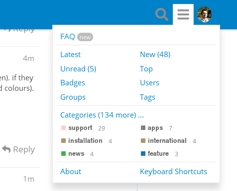
Sure. I added one.
well being greyed-out means: you can’t use them at the moment (from this particular screen). if they get active, their colour will change to white (and thus harmonizing again with the nextcloud colours). it’s no invention of nextcloud and their designers to “grey out” options you can’t use.
what would you suggest instead?
I’m on many Discourse forums and I’ve never seen these being greyed out or unusable.
Also they are clickable and seem perfectly usable for me so I’m not sure what you mean.
Do you have more functions on your side ?
awww sorry. you mean here in the forum. that’s true!
sorry i thought you’d be referring to the menu-bar of your instance.
ya. right… that could be polished up a bit. maybe we wanna call @jospoortvliet to make him aware of that?
hehe, yeah sorry the color scheme is the same on Nextcloud itself. I thought posting in the meta category made it clear enough I was talking about the forum.
not quite the same. only related. like the dimming doesnt go down to real grey but just not as bright white. ![]()
you are right. and i wish everyone could be that precise about the categorization of their postings ![]()
I’ve already addressed this problem a couple of weeks ago. Hopefully someone will fix it in the near future.
3 Likes