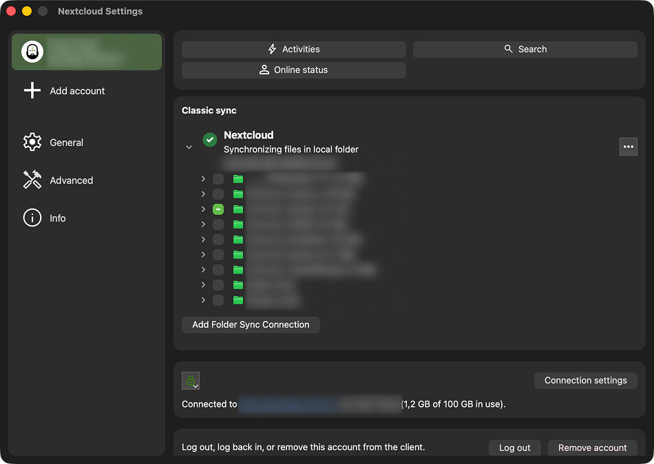
This post is simply a thank-you. It’s been so long since access to synchronisation was made difficult. Now, with this new version, as soon as I click on ‘Settings’, I’m taken straight to the files I want to synchronise : it’s brilliant ! Yes I have to do it several times a week.
Please don’t get rid of this new user experience.
On the other hand, it now takes more clicks to access the Activities view, which has actually improved significantly as it is now a proper window and, therefore is actually usable.
This is just a reminder that what’s important to one person isn’t necessarily important to everyone else, and I would guess that this is part of what makes good UX so difficult. Therefore, it’s nice to see someone praising a UI change, even if it doesn’t necessarily benefit me. But it’s probably not entirely selfless either, as there’s a hint of an underlying fear that things might change again.