Hi, i am having some kind of design issue, i use black as my main color because i think it looks good, now since the dark theme in accessibility is also working well, i would like to use that as well, but there are two small downsides:
first we can only set one main color, which changes the top bar and the icons. This is not an issue in standard “high contrast” theme as the background is white, but the dark theme has a nearly black background and i would prefere some light grey icons on that while the top bar should stay black. - that one i could overcome with “custom css” app, which i tried while posting this.
but what i could not fix yet, is the black icon for the more dots and the black icons in the dropdown, i think this is something the guys who made the dark theme would need to consider.
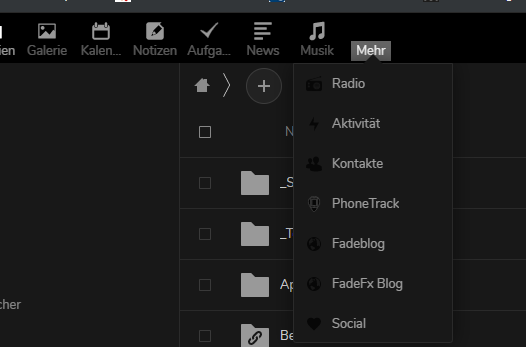
biggest issue here is that the more icon just disappears when not hovered